
Pfrsantos little corner of complaints
-
Looking at our current mobile I guess we don't have post numbers either.
One thing I've noticed that we are missing here is when we are replying it would be good to be able to scroll up to look at the previous posts. We are able to do that on the current forum. This is handy if you need to review what you are responding to, also allows you to add post quotes.
Okay, that's turning out to be a bigger job than I should start halfway through the day.
I'll tackle that tomorrow and see if I can get the posts to show up first
-
Okay, that's turning out to be a bigger job than I should start halfway through the day.
I'll tackle that tomorrow and see if I can get the posts to show up first
Thanks for all your hard work. I hope I'm helping with suggestions and not adding more grief to the process.
-
Thanks for all your hard work. I hope I'm helping with suggestions and not adding more grief to the process.
It's not grief- it's a shitload more work than I thought it was, and it makes me appreciate Micah more than ever, but it's worth every minute I'm spending on it.
I really don't want this software change to kill the forum, and every different detail has the potential to do that. This place has to give as close to the experience of SMF as possible- sometimes I'm a bit annoyed at your comments (I liked the other colors :insert Thwack smiley here:) but you are absolutely right, and I'll get over being annoyed!
Keep up the great work- I really do appreciate it, even if I grumble about it from time to time. And, even if I don't, I can't argue with making the forum better- the members deserve it.
:insert thumbs up smiley here:
-
It's not grief- it's a shitload more work than I thought it was, and it makes me appreciate Micah more than ever, but it's worth every minute I'm spending on it.
I really don't want this software change to kill the forum, and every different detail has the potential to do that. This place has to give as close to the experience of SMF as possible- sometimes I'm a bit annoyed at your comments (I liked the other colors :insert Thwack smiley here:) but you are absolutely right, and I'll get over being annoyed!
Keep up the great work- I really do appreciate it, even if I grumble about it from time to time. And, even if I don't, I can't argue with making the forum better- the members deserve it.
:insert thumbs up smiley here:
@Defender Hang in there, you're doing a great job !
-
Page numbers added instead of one long thread with 1,000 replies.
Currently limited to 20 posts per page instead of 25 on SMF. I feel like that's good enough (for now at least) but it's easy to change is anyone gets upset at missing five posts per page.
-
Yup, definitely see it on desktop.
Double fuck.
-
root said:
Interesting.
yep
root said:
Defender said:
Message history is showing on desktop but I don't see it on mobile.
Fuck
Looking better now.
yes indeed
Defender said:
Also need to remove the @xxxxx again when someone clicks Reply.
Yeah yeah, don't remind me, that's next.
Please remember, don't forget

-
Done?
The @xxxxx is gone on Replies as per request.
Previous posts are now listed under the Reply window, as per request.
Multi-quote has been added, which wasn't requested, but I assume will be a matter of time.
Quote appearance has (I think) been improved and is acceptable. If not, please let me know.
Login has been added to each screen rather than just on the threads themselves.
Dark Mode toggle is on every screen rather than just the main screen.
I have worked on sizing the columns and I think they are better- let me know if that needs further tweaking.
To Be Done
BBCode has still not been enabled yet.
Treasury Module has to be built, installed and set up.
Smileys (may come with SMF import)
Smurf Filter
Let me know what else needs to be done- yesterday I almost posted this version in this thread because I wanted more feedback: https://forum.multitool.org/index.php/topic,95315.0.html
Give me all you got- this place has to be running soon! I know there is more than needs doing, so let's get it done!
Enjoy the Entire Multitool.Org Universe:
SAKWiki.com
EDCTV.Org
GearFeed.Org -
Done?
The @xxxxx is gone on Replies as per request.
Previous posts are now listed under the Reply window, as per request.
Multi-quote has been added, which wasn't requested, but I assume will be a matter of time.
Quote appearance has (I think) been improved and is acceptable. If not, please let me know.
Login has been added to each screen rather than just on the threads themselves.
Dark Mode toggle is on every screen rather than just the main screen.
I have worked on sizing the columns and I think they are better- let me know if that needs further tweaking.
To Be Done
BBCode has still not been enabled yet.
Treasury Module has to be built, installed and set up.
Smileys (may come with SMF import)
Smurf Filter
Let me know what else needs to be done- yesterday I almost posted this version in this thread because I wanted more feedback: https://forum.multitool.org/index.php/topic,95315.0.html
Give me all you got- this place has to be running soon! I know there is more than needs doing, so let's get it done!
root said:
Let me know what else needs to be done- yesterday I almost posted this version in this thread because I wanted more feedback: https://forum.multitool.org/index.php/topic,95315.0.html
Give me all you got- this place has to be running soon! I know there is more than needs doing, so let's get it done!
Great progress

- Size of pictures in post a bit small
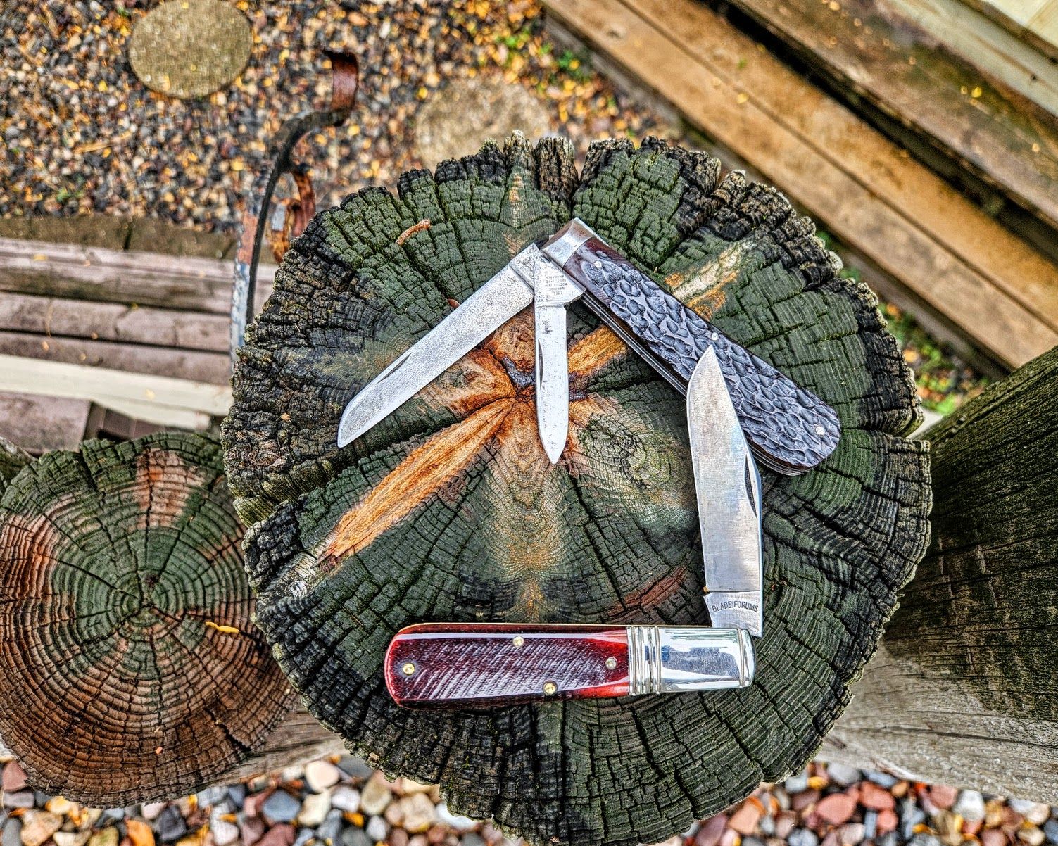
- Can we have the option to hide the sidebar with the community links, which makes the page wider for viewing like on the old forum.
- Seems like we lose a lot of width on the page with the tool bars / menus on either side of the page rather on top like on the old forum.
-
root said:
Let me know what else needs to be done- yesterday I almost posted this version in this thread because I wanted more feedback: https://forum.multitool.org/index.php/topic,95315.0.html
Give me all you got- this place has to be running soon! I know there is more than needs doing, so let's get it done!
Great progress
- Size of pictures in post a bit small
- Can we have the option to hide the sidebar with the community links, which makes the page wider for viewing like on the old forum.
- Seems like we lose a lot of width on the page with the tool bars / menus on either side of the page rather on top like on the old forum.
example


Hello! It looks like you're interested in this conversation, but you don't have an account yet.
Getting fed up of having to scroll through the same posts each visit? When you register for an account, you'll always come back to exactly where you were before, and choose to be notified of new replies (either via email, or push notification). You'll also be able to save bookmarks and upvote posts to show your appreciation to other community members.
With your input, this post could be even better 💗
Register Login